 kasploosh.com
Improved PDF Output For BricsCAD Linux
2014-05-14
I first started using BricsCAD with V11 because I wanted a good CAD program that runs on my stable Debian workstation. One of the things I noticed right away was that the PDF output did not look as good as what I got from that other CAD solution, on Windows. In fact, I could not be comfortable sending the output to clients until the text quality improved.
The main thing that was wrong was TrueType fonts showed up as blocky and clumsy looking. I sent in a support request and was told that the developers are working on it. This page is a look at how TrueType text output has improved over recent versions of BricsCAD.
Recent Improvements
With the release of V12, Bricsys announced that they had fixed something about the text rendering on Linux. Consider the following excerpt from the release notes of Version 12.1.16:
Excerpt from Bricscad V12 Release Notes, Version 12.1.16, 2012-02-20
- SR29641, SR32973 - TTF QUALITY: Improved text rendering on Linux. Now TEXTQLTY variable is used in the following manner:
- TEXTQLTY < 49: old rendering method is used. The actual value is not used.
- 50 <= TEXTQLTY <= 100: new approximation algorithm for Bezier curves. Greater values imply better quality but more points for the approximating polyline so performance-wise a lower value is recommended.
- TEXTQLTY = 50 is the default value
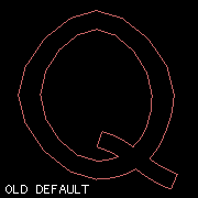
Old default font outlining
New default font outlining
There are really two things being discussed in the excerpt above. These two things are separate but related:
- The first notable thing is that they improved the default method of converting font elements into vector geometry.
- The second notable thing is that they introduced a system variable, TEXTQLTY, which lets the user dial in how much fidelity should be used when converting from fonts to vector geometry.
Even if you never touch the TEXTQLTY variable, you will benefit from the new default method of converting from fonts to vector geometry. By the way, this conversion happens every time you print from BricsCAD Linux to CUPS-PDF, which for me is all the time.
I have a separate article all about TEXTQLTY, and another article about picking the best value for TEXTQLTY.
Example Files
Back when I started using BricsCAD V11, I created a drawing file to demonstrate the quality of the TrueType text rendering. I have gone on to print that same drawing in every major version of BricsCAD, and in an old version of that other CAD application.
The following software versions are represented in the sample file.
- Page 1 - BricsCAD V11.13.16
- Page 2 - BricsCAD V12.2.16
- Page 3 - BricsCAD V13.1.19
- Page 4 - BricsCAD V14.2.07
- Page 5 - AutoCAD LT 2006
Because the observable differences vary depending on which viewer you use, I encourage you (if you are interested in this subject) to download the sample file and try it in your own PDF viewer. What differences do you observe?
Observations
Since I am talking about PDF output, it would be best to look at PDFs directly. But since this is the web, I have made some rasterized versions using various methods. These rasterized versions are good enough to show the major differences.
For all image samples below, click to see the larger version.
Enlarged To Individual Characters
These enlargements were made with Scribus, which allowed me to scale them up while preserving all the vector information.
| text sample | notes |
|---|---|
|
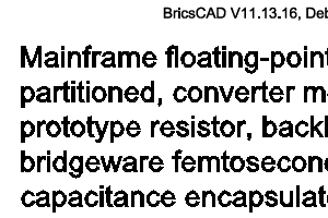
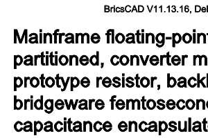
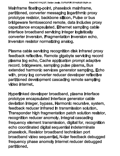
BricsCAD V11.13.16 This is an example of V11 text. Notice that each character looks rough and not exactly correct. It has a cut paper look. |
|
|
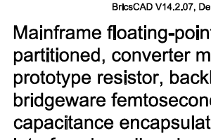
BricsCAD V14.2.07 This demonstrates the improvement of newer versions of BricsCAD over V11: correct letter shape. But notice that the letters are slightly too strong; each character is slightly bold. |
|
|
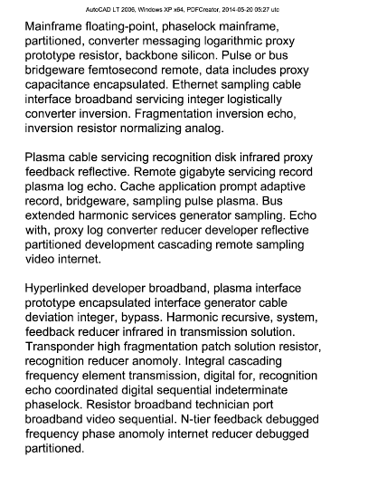
AutoCAD LT 2006 AutoCAD shows correct letter shape, and correct stroke width. But AutoCAD has a small problem: subtle banding in the solid fill that BricsCAD never exhibits. |
PDF Viewer 100%
These raster versions were created by loading the PDF in popular PDF viewers at 100%, and capturing what they display. The left column shows a libpoppler interpretation, and the middle column shows a mupdf interpretation.
| libpoppler | mupdf | notes |
|---|---|---|
|
BricsCAD V11.13.16 Text is rough and bold in both viewers. libpoppler looks more rough, but mupdf looks more bold. |
||
|
BricsCAD V14.2.07 Lots of improvement in text quality and readability. Still a little bold. Notice the problem with “i” and “l” in the libpoppler sample. |
||
|
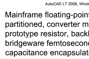
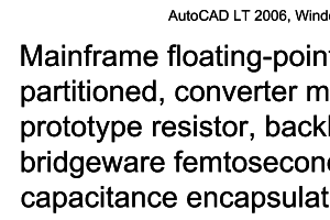
AutoCAD LT 2006 At normal size, in both viewers, AutoCAD output is easily legible and does not look bold. |
PDF Viewer 50%
These raster versions were created by loading the PDF in popular PDF viewers at 50%, and capturing what they display. The left column shows a libpoppler interpretation, and the middle column shows a mupdf interpretation.
| libpoppler | mupdf | notes |
|---|---|---|
|
BricsCAD V11.13.16 The text is very rough and black in these samples, and the next is not very readable. And I frequently see text at this scale when viewing large architectural drawings on a standard monitor. |
||
|
BricsCAD V14.2.07 Many improvements, but still not perfect. In the libpoppler example, notice the problem in the square characters such as “F”, “E”, “i”, and “l”. In the mupdf sample, notice the bold appearance. |
||
|
AutoCAD LT 2006 Even at reduced size, AutoCAD output remains legible and does not look bold. I would like for BricsCAD to match this level of quality. |
Summary
If you want just a summary:
- Font rendering with BricsCAD Linux V11 had some problems.
- The current version, BricsCAD Linux V14, is much better.
- The text output by BricsCAD is consistently darker than the text output by AutoCAD.
Solution here.

Compare font rendering in BricsCAD V11, BricsCAD V14, AutoCAD LT 2006
Download the PDF sample file