 kasploosh.com
BricsCAD Is Double Printing Each Character
2014-05-23
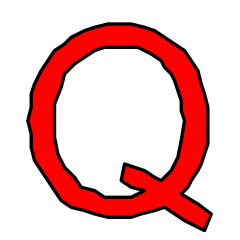
Each character printed twice.
Once for the outline (black),
Once for the fill (red).
Click to enlarge
Dear Bricsys Developers,
I would like for BricsCAD Linux to have TrueType text rendering that is as good as any other solution. That is why I spent many hours figuring out why BricsCAD text appeared darker than normal when printing to CUPS-PDF.
The font rendering in V14 is much improved. But there is one more easy fix to make.
BricsCAD is currently double printing each character (when printing to CUPS-PDF and converting TTF text to geometry). It prints each character once, which is the filled polygon. Then it prints each character again, which is the stroke on the boundary polyline.
Please add a way to turn off the outline when the fill is being used.
Small Text Appears Bold
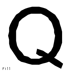
3/32" (2.38mm) Arial Q
Example bold effect
Click to enlarge
The outline increases the width of each character by half the stroke width all the way around. This creates a bold effect that is most noticeable on small text. See the example animation.
The fill is more accurate than the stroke. The fill stops right at the boundary, whereas the stroke is half on the inside of the boundary, and half on the outside. The stroke causes characters to grow by ~2% at small sizes.
How To Fix
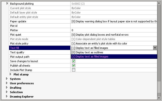
Where text fill and stroke is controlled
in the BricsCAD settings
In the BricsCAD settings, at Program Options > Plot and publish > Text fill, you currently have two options:
- [0] Display text as outlines
- [1] Display text as filled images
The problem is that with choice [1] above, you actually get both fill and outline.
The solution is to change from a binary setting to a bitmask setting which can store at least three values. Now at Program Options > Plot and publish > Text fill you will find three options:
- 1 - Display text as outlines only
- 2 - Display text as fill only
- 3 - Display text as both outlines and fill
The benefit of this approach is that the existing behavior (3) is maintained into the future, but the better behavior (2) is introduced and usable.
Benefits Of Fixing
| PDFs will look better | The fill is more accurate than the outline because it stops right at the boundary. That means text will have a more natural shape. |
|---|---|
| Text will not appear bold | Text will be the appropriate weight and not be enlarged by the outline. Text produced by BricsCAD will no longer appear bold in popular PDF viewers. |
| Small text will be more legible | Removing the bold effect will mean that text is more legible at small sizes. |
| Smaller PDF file size | Currently each character is stored twice (fill and outline). Removing the outlines means removing duplicate data. Drawings with lots of text will see the biggest benefit. |
Some Numbers
I’m working with 2.38mm text. I measured my sample character to be 2.48mm tall and 2.28mm wide. I measured the stroke to be 0.05mm wide. That means the stroke has added 2.19% to the width of the character, and 2.02% to the height of the character.
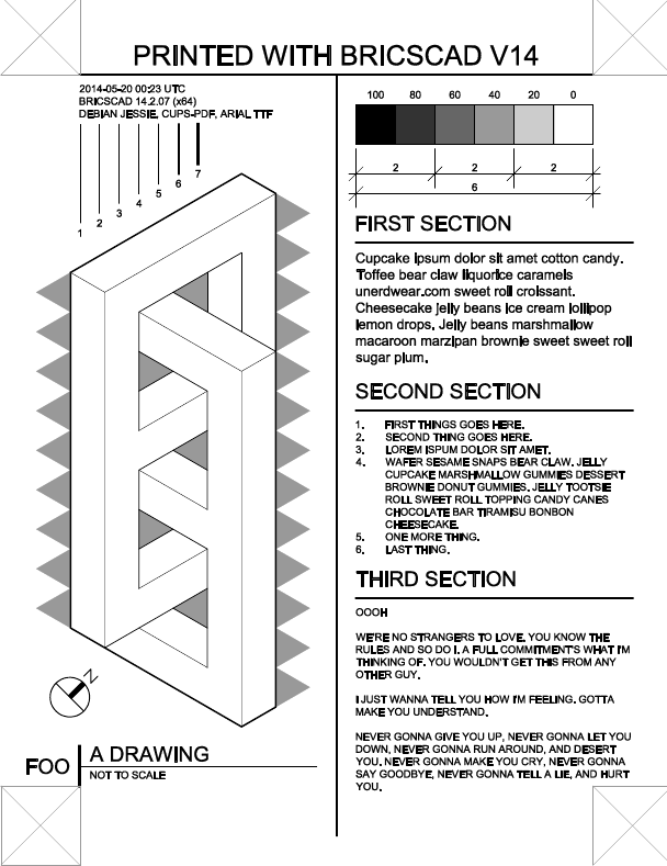
Example Files
I have a sample drawing file that I printed with both BricsCAD V14 and that other CAD application. Because the amount of difference varies depending on the PDF viewer used, you should download the test drawing and observe the differences for yourself (if you are interested).
If you don’t feel like downloading the sample file, here are rasterized versions of the pages. These raster versions were made by taking screenshots of a libpoppler viewer. Click the image to see a larger version.
|
|
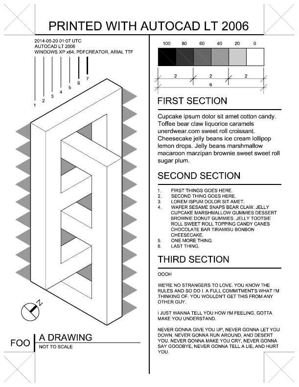
| Demo file printed by BricsCAD, viewed with libpoppler viewer. Click to enlarge. Notice the bold appearance of the text, and the problem with certain text characters. | Demo file printed by AutoCAD, viewed with libpoppler viewer. Click to enlarge. Text is correct weight, but notice the printing doesn’t go to the edge, and there is streaking in the solid fill areas. |
This is a table of differences between the two files:
| BricsCAD V14 | AutoCAD LT 2006 | |
|---|---|---|
| Paper Size | Wrong: 609 x 790 points | Correct: 612 x 792 points |
| Page Layout | Good, except for paper size problems which can be seen at the registration marks in the corners | Good, but doesn’t print all the way to the edge (registration marks are cut off) |
| Line Weight | Correct | Correct |
| Text weight | Slightly bold appearance. More noticeable in some viewers than others. | Correct |
| Solid fills | Correct | Visible streaking in solid fill areas. |
Screencast
And finally, here is a screencast that shows me decomposing two sample PDFs using a vector program (Inkscape).- I first decompose some text printed by that other CAD application, and show that it is only composed of fill.
- Next I decompose some text printed by BricsCAD V14, and show that it contains both a fill and outline at the same time.
- Finally I change the color of the fill and place it on top of the outline, showing that the outline is bigger than the fill (the outline bolds each character).
Summary
BricsCAD TrueType text rendering will be in great shape if we can get an option to turn off the boundary stroke when the polygon fill is being used.