 kasploosh.com
BricsCAD Best TEXTQLTY Setting
2014-05-23
In the previous entry, I looked at what the TEXTQLTY variable actually does, and how it works. Now I want to look at why 50 is often a better choice than 100.
Basic Settings
For drawings that have a lot of small text, you are better off with the default TEXTQLTY value of 50. This is because small text does not get better at larger values, and it may even get worse. Also, higher values increase the computation needs of your drawing.
If you have a small amount of text that will be seen at a large scale, you might want higher values of TEXTQLTY. An example of when you might want a high level of TEXTQLTY is when doing signage, where letters are output at a large size.
Interesting Puzzle
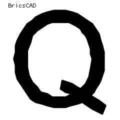
Compare BricsCAD default (50)
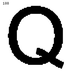
with BricsCAD max (100)
Click to enlarge.
As seen in the previous article, a setting of 100 is much more precise than a setting of 50. Yet in my tests of 3/32" (2.38mm) text in PDFs, 100 looks worse than 50.
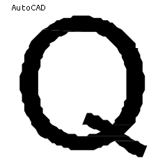
AutoCAD doesn’t get
perfect output either.
Why is it that higher values of TEXTQLTY, which make the outline more faithful and precise, look worse in my PDFs? This is the puzzle.
The puzzle is deeper than just BricsCAD on Linux. That other CAD application, on Windows, exhibits the same faceted quality to small text in PDFs. Why do they not get perfect outlines of font characters?
Clues
The answer is in three parts:
- 1. Straight Line Tracing
- TrueType font characters are made out of nice curves and straight lines. But when the CAD program converts these characters to vector geometry, it approximates the curves using straight lines. The fact that the font characters are traced with straight lines means they will always be somewhat faceted.
- 2. Small Text
- I have been studying small text. I commonly use 3/32" (2.38mm) text for notes. If I were studying larger samples of text, the problem would be less observable. When a font character is converted to geometry, it is traced with small line segments. The smaller the character is, the smaller its little line segments are. Small text has tiny line segments making up its outline.
- 3. Output To PDF
- When in CAD, the polyline that traces the outside of each character can be faithfully stored and retrieved. That’s because the CAD program has a great deal of accuracy. It has enough accuracy to keep track of even very small line segments that outline each character. But the PDF environment has a more limited amount of accuracy. The limited accuracy could be due to the distiller, or to the PDF format itself.
Answer: Put It All Together
If a small text character is represented by many small straight lines, and the output format does not have enough accuracy to represent those small lines, then rounding errors will happen.
The distiller would like to place each point in the right place, but instead it settles for the best point available. When a letter has many segments (high value of TEXTQLTY), it has more opportunity to create a stair-step effect on the curves.
It’s a lot like if you tried to trace a letter in CAD with the SNAP on. You do your best to trace it, but it comes out a little jagged and perhaps with stair-steps.
What’s most interesting is that when you observe the stair-steps, you are seeing the effective resolution of the PDF. The stair-stepping is the limited resolution made visible.
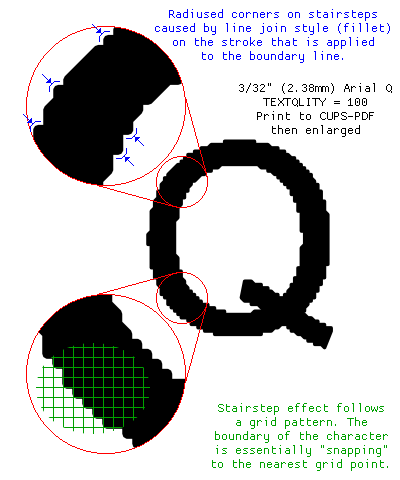
Enlargement showing the specifics
of the stairstepping effect
at higher levels of TEXTQLTY